Interview – 4.12.2022
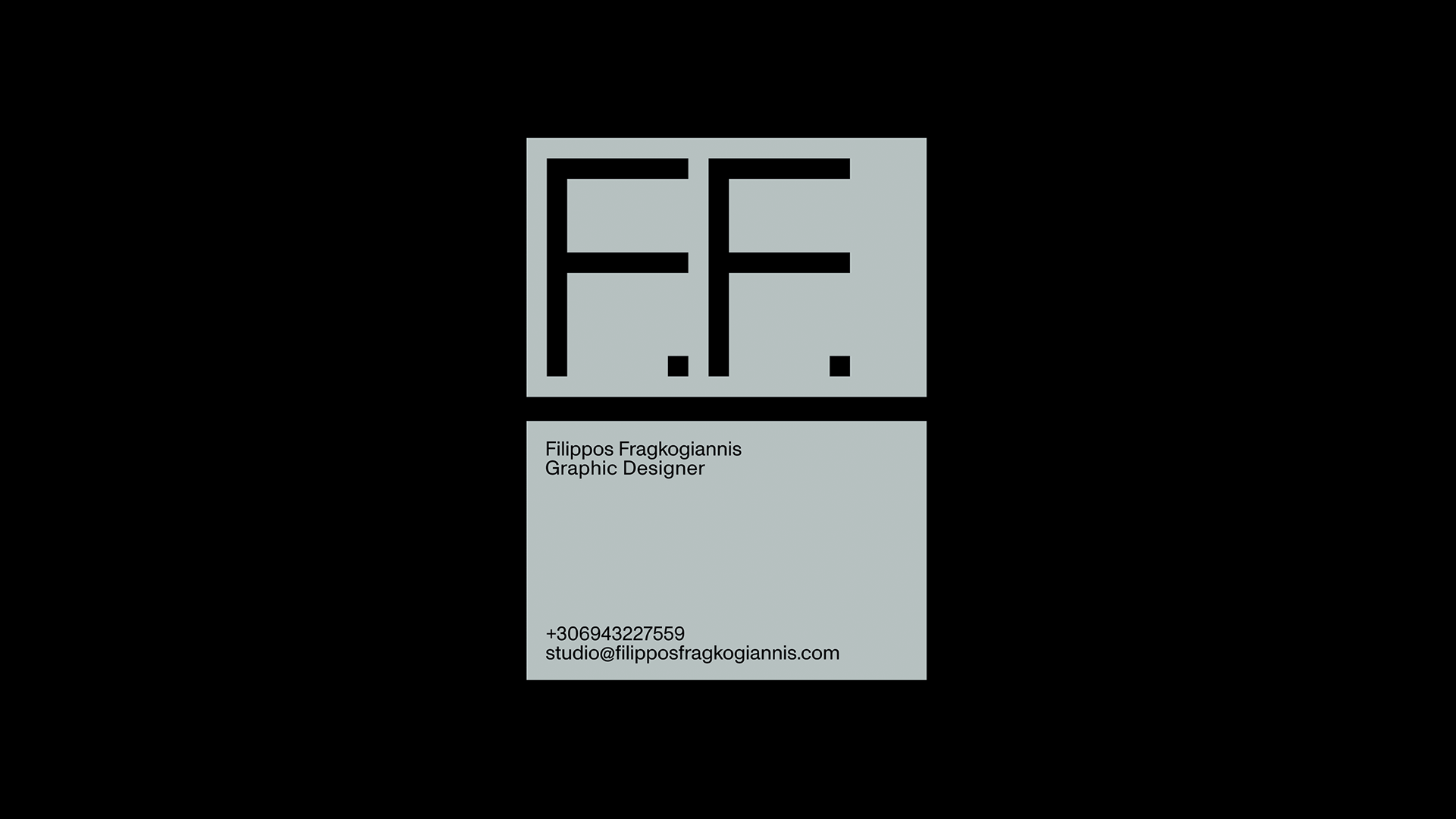
Filippos Fragkogiannis
Filippos Fragkogiannis is a Greek graphic designer and art director who has been freelancing in Athens since 2019. He applies a research-based approach to his projects, which has origins in semiotics and symbolism. His projects include visual identities, print advertisements, merchandise, editorial design, posters, and substantially more. Filippos’ attraction to the visual arts has also been manifested through his long-term involvement with photography and graffiti at various points in his life.


PM—Filippos, how's it going, mate? What are you up to these days?
FF—Hey Damien, I am sincerely delighted that we are having this discussion in a public context! As well as I am excited to be hosted at Projektmono, a page I have held in high esteem for years.
I am currently creating the conditions for the years to come, gradually expanding the spirit and the quality of my services on top of achieving side goals. As I am slowly reaching my thirties, I am entering a whole new period, and I'm eagerly collecting elements and nuances to fill the new pages of the book of my life. I genuinely want to be optimistic and motivated to continue following my dreams.
PM—How's the weather in Athens? How's the design and creativity over there?
FF—Athens offers numerous options for extroversion and entertainment all year round, activities to suit all preferences. I'm glad I grew up in Athens' multifaceted and inclusive culture. To this day, I am still learning from it, finding out how this city flourished and declined centuries before me, which will continue after the passing of our generation.
Athenians genuinely love and admire the arts, promoting them as a significant good for citizens. This modern city's artistic creations and expression have undoubtedly had influences from the ancient beauty and the masterpieces that have emerged during its history. There was always a search for the ideal and purity in creation which is inspiring. Design in Greece has made remarkable progress, and with time, its value is more appreciated and is a point of high interest for the buying public and domestic entrepreneurship.
Greek creators and designers have education, high potential, and valid expertise concerning graphic design, advertising, fashion, photography, publishing, architecture, and interior decoration, as well as the creation of valuable objects, furniture, sculpture, and jewellery. All of the above makes them recognisable and competitive in the modern commercial world.
PM—So, how did you decide to become an independent graphic designer and start your own business?
FF—The relentless personal work I put in during my studies convinced me that through introspection and concentration, a person can achieve their goals, even by themselves, without always needing third-party intervention.
In the past, I have pursued operating within collaborative frameworks. Generally speaking, cooperation is beneficial and perfectly legitimate, as it can yield spectacular results. However, the downside is that significant concessions or retreats may need to be made for hierarchy's sake, distorting a designer's values and leading to disputes.
My decision to be and remain an independent designer does not rule out collaborations or the contribution of new people and ideas. Yet it delimits the norm I want to apply to how I work, fulfilling my qualitative goals criteria within the necessary time horizon and the corresponding thoroughness of selected content and style.
PM—You only get to use one typeface for the rest of your life; which one do you choose: Helvetica Neue or Times?
FF—My honest answer is that if it were mandatory for me to choose between two typefaces for the rest of my life, I would give up on typographic design altogether. Instead, I would turn to other techniques which wouldn't make me suffocate from a lack of options.
Now, sidestepping that question, if I had to choose one typeface for the rest of my life, it would be Times. Indeed, nowadays, there is an increased use of sans serifs; however, serif typefaces undoubtedly carry an enhanced poetic interest, charged with a sense of the past and the connection with the beginning of typography as we know it today. For something as important as the rest of my life, I ask you: write my name in Times (laughter)!
PM—Haha, will do. Your work and style are obviously type-oriented. How did you become so interested in typography?
FF—I like the social nature of writing and how it can bring us together and inform us as a fundamental skill. From a young age, I appreciated the systematization and principles that define the philosophy of journalistic and political speech, which varies from country to country, redeeming local codes, prejudices, and stereotypes, and, more broadly, the context of local culture, identity, and tradition.
Typography gained my interest over time after studying and practicing it for several years as a graffiti writer. Typography can be expressed in numerous styles and forms with many techniques. Still, this craft always remains charged with the multilayered meaning of words and the typographical symbols through which it is conveyed.
For me, it was interesting to compare how a creator captures the letter "R", how a word can successfully start with a "W", and how the "S" can work at the end. Typography is an art that requires constant decision-making.
The choices that are made actively interact with each other and affect the proportion intake. Depending on the depth of understanding of the function and form of the typeface, a designer can consider even more quality constants, resulting in remarkable results.
PM—Awesome, I was pretty heavy into the Melbourne Graffiti scene growing up. Tell me more?
FF—My current practice is informed by a decade-long involvement with graffiti. Tags, names, and letters were the main elements my crew was spraying in the streets at the time. This premeditated injection of verbal forms in public spaces has much in common with how posters make walls speak. No wonder why my early steps as a graphic designer were making posters for school parties, graffiti stores, and rap artists’ concerts.

PM—Favourite typeface at the moment?
FF—An exciting release is Pleasure Typeface by Pizza Typefaces in collaboration with Flirt Studio. Very hard to overlook what a quality and complete project it is. This type family graces my collection, and it's apparent that it has multiple positives. However, it needs special attention in its handling, as it has unexpected characteristics and peculiarities in its form.
In general, Pizza Typefaces demonstrates essential virtues, starting with a deeply liberated and progressive style and in-depth knowledge of their subject matter, positively surprising everyone with their sophisticated but bold choices.
If I chose to show a non-connoisseur how quality, playful and provocative typefaces are nowadays and how they respond to the modern demands of visual communication, I would happily introduce them to Pleasure.
PM—What interests do you have outside the industry?
FF—I’m attracted to the internet and how it works. I am interested in website optimisation and social media marketing, I have developed my knowledge in it, and soon these will be part of my services.
Also, as you already know, I am interested in curating design projects on the internet. I like the critical approach and constructive evaluation. It is a process that offers me a lot, both in terms of deepening my expertise and making meaningful self-criticism free from subjectivity as much as possible.
PM—What attracts the type of projects you take on?
FF—I believe the exact reasons a client reaches out to me, or how precisely I end up working on a project, is mainly about the client's desire to work with a designer with my characteristics. Judging from the collaborations I have made so far, the most interesting projects have been with clients who clearly understand what they expect from me and my services. They had no inhibitions about the specificity of my work style and had confidence that I would find a satisfactory and functional solution for their case.
PM—What is your best piece of advice for someone looking to break into freelancing?
FF—Allow me to answer this question in an epigrammatic way:
Always cover your company's legal and financial obligations first.
Distinguish your primary and secondary specialisations in the field of design and communication.
Build a timeless image of yourself and your personal brand.
Work diligently in the area of presentation and explanation of your work.
Leverage the vital internet and social media space to make your services more accessible.
Give support, acceptance, and patience to receive a substantial return.
Make the first move yourself, set high goals, and believe in achieving the unexpected.
PM—You recently released a single weight-free font. Can you tell us some details about it?
FF—With great pleasure! Vercetti Regular is a free-for-download font that I released in collaboration with Richard Mandona, a young and talented typeface designer from Saint Petersburg. All its details were carefully drawn and corrected with a fine finish in mind and with Vercetti as an efficient good directly accessed by the creative community and the general public.
As a result, the Vercetti font aspires to be another consistent and well-polished option in the font book of any proficient designer, student, or individual; hence, it is distributed as a free font under Licence Amicale.
“TYPOGRAPHY GAINED MY INTEREST OVER TIME AFTER STUDYING AND PRACTICING IT FOR SEVERAL YEARS AS A GRAFFITI WRITER.”


PM— Is print dead? Where do you see the industry heading in the future?
FF—No, I don't think print is dead. If this were the case, we would not be at the edge of this question for so many years. I prefer to treat this question as a playful expression, which in essence, within a digitised context, underlines the value of printing and its need to survive and continue to exist as a technique, giving material form to design. However, precisely because the media and communication channels are now very different, print, both for cost and saving natural resources, as well as usability, has already acquired a different position from the one it has held until now.
Paperwork and paper correspondence is dramatically reduced, and many of the things that used to be recorded on paper, such as contracts, medical reports, travel documents, certificates, tickets, and invoices, are now in digital form.
PM—What tunes are you currently bumping?
FF—You can check out my Spotify here. You will find a playlist with tracks that excite me, accompany some of my personal moments, or are in the background when I draft projects and experiment.
PM—You are the founder of Certain Magazine. Can you tell us how this started and what has kept you going?
FF—Certain Magazine made its debut on Instagram in the summer of 2018. Since then, it has grown considerably and, at times, significantly expanded, with thousands of users passionate about creativity and visual communication.
Four years later, this idea has matured more, the hashtag has been used in 350 thousand posts on Instagram so far, and as of October 2022, Certain has a new logo. It is a revised and improved version of the first one, yet without significant changes in its style and form.
PM—Any plans to expand Certain Magazine's presence and offer new features to its audience?
FF—Certain Magazine will get the first version of its website during the new year. This project will certainly be active in 2023, and I would like it to mark yet another milestone of this initiative.
I look forward to the involvement and participation of more people in the future. I love this form of communication, as well as creating the feeling of satisfaction, accomplishment, and recognition in creative people who present and materialise mature concepts and well-executed design projects.
PM—Really, what is your favourite type foundry?
FF—Speaking of my favourite type foundries, I will mention Blaze Type, Dinamo Typefaces, Displaay Type Foundry, Extraset, Gradient Type, Kometa Typefaces, Lift Type, Nikolas Type, Letter Omega Typefaces, Omnibus Type, Pizza Typefaces, Superior Type, Monotype, Pangram Pangram Foundry, The Designers Foundry, W Type Foundry, 205TF, Monkeytype, Boulevard LAB, Velvetyne, Heavyweight Type and Hot Type.
While I'm sure I've missed a few more that I would consider favourites, these are an informative list of sources for fonts that I find reliable and fully functional for a high-end project. The type foundries mentioned above may have different characteristics, values, and orientations. Still, what they have in common is the thorough care of their products, contributing substantially to modern typography and offering both quality design and equally good software.

“CERTAIN MAGAZINE MADE ITS DEBUT ON INSTAGRAM IN THE SUMMER OF 2018.”


